Showing posts with label hue. Show all posts

Dec 22, 2010

TABLETOP TUESDAY - green hues

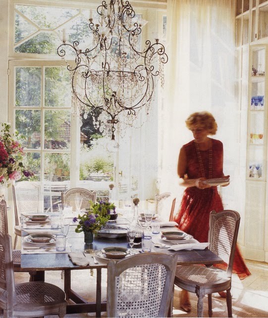
for the holiday table, i'm thinking hues of green + cream with a dab of gold....and you?


note it:


(photo credits: anthropologie catalog, nov '08; elle decor, jan '10; unknown; gumps ad; anthropologie catalog, nov '08)


Nov 3, 2010

HUE: hot, hot, hot pink

this palette is so unlike vincente wolf that i thought it was fun to see he used it (begrudgingly perhaps?) in apartment decorating challenge that he agreed to do for the new york times.

i immediately thought that amy butler's first wallpaper collection for graham & brown could be the perfect way for a girl to indulge in hot pink fancy. (i'm a sucker for this hue....)

i really like her "lacework" in sunset color way (+ all colorways, in fact) as well as "temple tulips" in sunset color way.

they both have just the right amount of sugar + spice....

note it:


Oct 22, 2010

HUE: moss


happy friday!

j crew hues for you: moss, charcoal, tomato red.

(am lusting over those fab-o platform peep toes too....)

more grey+red and grey+yellow color combos here.

note it:

(image credits: j crew catalog, nov10; benjamin moore "savannah moss,"kendall charcoal," "tomato red")


Sep 21, 2010

TABLETOP TUESDAY - fashionable tole

these images from DVF's spring 2011 collection reminded me of these colorful tole trays that i snapped back in summer of 2009 at the springfield antique show + flea market, just outside of columbus, ohio.

corals, spring greens, pale greys, touches of blue. painterly patterns. color blocks. (the palette is right on par with pantone's spring 2011 color predictions - yay, diane!)

DVF's collection was inspired by isadora duncan and greek architecture, sky, sun and goddesses. clearly, she was spot on. what beautifully draped clothing and shoes.

and what about the models' lipstick - loved! i was immediately transported me to sunny santorini...

(it looks like a shade called "heat wave" from nars that i own + have been remiss to wear. come april, the hot lipped me...!)

boy, did i swoon over this collection. seems so wearable, relatively affordable, versatile, comfortable + so greek chic.

just like DVF herself.

now, back to the tole...tole trays like these make for fashionable tabletop, don't you think?

note it:

(photo credits: lissa lowe/tole; others/DVF)


Sep 17, 2010

HUE: spring 2011's "wordly" palette


spring 2011 ushers in a playful + worldly palette that transitions nicely with fall/winter colors. while this palette represents directional colors for women's fashion, interiors is sure to follow suit (ha).

why? according to pantone's spring 2011 fashion report, designers want to give "consumers a chance to escape from everyday challenges with intriguing color combinations that conjure thoughts of tropical destinations and feelings of faraway lands."

it struck me that this striped chair i spied in a back issue of house beautiful (march 2005, ahead of its time) nods to this lively spring mix. not only perfect for textiles, why not consider a "coral rose" in textured grasscloth wallpaper or paint surrounded by crisp "super white" trim. or paint.

try phillip jeffries for amazingly colorful textured wallcoverings, like "vinyl glam grass coral" (a tempered coral rose as not quite as bright) or "extra-fine arrowroot in key west" (like peapod) "juicy jute grasscloth in blueberry" (similar to regatta).

who doesn't need daily sunshine to perk up a workday morning?

well that, and some serious java....

(speaking of, have become addicted to san francisco's ritual roasters, "miraflores." their frequent buyer card says "heavy drinker." so clever - i am one! i'll try to post a pic of this cute card soon).

note it:

Aug 26, 2010

STYLE IT: door it

mini-breaks are so underrated.

we slipped away to tahoe, came back + i have been running around ever since.

labor day, here we come!

door it.


note it:

(photo credit: house beautiful)

Aug 13, 2010

HUE: that's hot!

it started with this ad....

love the walls.

love the kiss.

and then kept seeing this color combination EVERYWHERE...all in the same day.

so i scanned what i found.

and i think, this royal-ish blue, fuchsia, bubblegum pink combo tempered with pure white and silver is pretty darn fun!

feels a bit african. world vibe.

feels HOT!!!

like summer just won't end.

and, why should it?

note it:
"waka, waka" by shakira ("this time for africa," official song of the fifa world cup)

p.s. glidden, ad maven in me feels that it would have been helpful if you had included - somewhere in tiny mouse type - the color of pink you used on the walls in your print ad. how else can consumers shop for it?

(photo credit: glidden ad-photo 1; anthropologie wallpaper-photo2; nest-photo 3; sarah magid-photo 4/5)


Aug 1, 2010

DAILY DOSE: domino

soft and pretty.

the ceiling really is the fifth wall. the floor would be the sixth.

why not make it feel ethereal?

resources:

~ robin's egg blue ceiling paint - "skylit" by pratt and lambert.

~ café au lait walls - "lambswool" by pratt and lambert (latex flat, 2 coats)

~ café au lait trim - "lambswool" by pratt and lambert (latex satin, 2 coats)

or go eco with selections from farrow + ball, known for historical colors. or choose a more affordable, accessible option from martha stewart's new line of paint at home depot. you can order 8 ounce samples too from the 280 handpicked color palette.

~ turquoise accents (while this is from 2005, pantone chose turquoise as the color for 2010. more here.)

for other ideas, check out erin's blog: house of turquoise. she's obsessed with the hue.

(photo credit: domino/september 2005)

Jul 13, 2010

TABLETOP TUESDAY - blue tues

found these in a folder of mine today.

though varied, the common thread is the hue of blue. so i decided to post them all on the spot.

yep, today feels like a blue tues and these images perk me up.

note it:


(photo credits: elle decor + bhg/close-up tabletop)


Jul 2, 2010

DAILY DOSE: domino

i think this combo is still quite sultry....

resources:

benjamin moore

~ "white dove" flat (ceiling)

~ "rose petal" latex eggshell (bedroom)

~ "jeweled peach" leatex eggshell (study)

~ "white dove" satin finish alkyd enamel (trim)


(photo credit: domino/spring+summer 2005)

Jun 9, 2010

HUE: sunny yellow


what a cute house!

crisp white, black trim, sunny door, graphic house numerals, inviting "green" porch. would be easy to spruce-it-yourself (the door, porch, numbers and plants, anyway...).

here are some yellow paints to peruse:


get those fantastic "neutra" house numbers here at dwr - on sale too for $40 each!

(man, i swoon for richard neutra, an unbelievable architect. the kaufmann house in palm springs is simply stunning. one of my most favorite houses ever...i'm all about the glass.)

find gardening tips from margaret roach's blog "away to garden." after all, she used to work for martha. and this house is from martha's former magazine, blueprint.

what 'cha waiting for? perk up.

note it:

(photo credits: sadly, the now defunct blueprint/house + thisnext.com/neutra numbers)

May 26, 2010

STYLE IT: jolt

with the weather here in san francisco gloomy, i needed a little jolt!

these "special edition" pink neon sperrys by jeffrey (nyc + atlanta) did the trick.

ahhh...hand me a fruity drink.


note it:


May 10, 2010

MAKEOVER MONDAY - redressed

then:
this dresser started out pear green. paired with citrine + cream accents against a backdrop of "white sand" (benjamin moore) walls, it resided in our home in ohio. scroll down...

now:
it is glossed in "nimbus cloud" low odor, low VOC high-gloss paint from the martha stewart paint collection for home depot. lacquer-esque, i love it!

placed against a came-on-the-walls pale peach in our rental in california, i completed this revamp by choosing glass knobs from anthropologie so the color shines through. accessories include a turquoise glass table lamp that i had previously purchased from crate + barrel, handmade art by my son (then 2) + the cutest succulent in a little vintage tea cup.

how:
it took a weekend to sand, prime (see the drawer to see the previous green color) + paint. redone, it softens our new bedroom.a little elbow grease never hurts - and can make you proud of a job well done!

May 2, 2010

STYLE IT: black trim

graphic, neat + trim.

very cool.


note it:


(photo credit: home by stafford cliff)

Apr 5, 2010

MAKEOVER MONDAY - pink pop

today i feel like a pink pop....

you really don't need much more.


note it:


(photo credits: house beautiful/door in "drop dead gorgeous" from benjamin moore; house beautiful/chair; pink window trim/lissa lowe)


Apr 4, 2010

COOK IT: tie dye eggs

happy easter!

note it:

(photo credit: lissa lowe)

how to for kids:
rip strips of painters tape to create tie dye pattern. dunk into dye(s). remove eggs when desired hue reached. let completely dry before removing the tape. (then, hide!)


Apr 1, 2010

HUE: lovely by the sea

i've been thinking a lot about soft pink these days....so much so that this palette is one that my client and i are considering for her seaside cottage in mendocino.

these remind me of the weathered hues of a home tucked away in the hills of the south of france.

i imagine this hideaway filled with well-loved furnishings and "found" objets d'art, treasures of the every day.

where the inspired hues of "chinchilla," "cumulus cloud," "sparkling brook," "opal," "sea glass," "spring melt," "sugared pansy pink" and "wrought iron" come to rest.*

it would be a place that shows its age and yet its timelessness too.

its soul revealed as layers of plaster chip away.

i wish it were mine...and in my mind's eye, it is.

note it:


(photo credits: pottery+sofa images/essentially french, tidepool/unknown; sea glass/waterside living. hues cited are from the martha stewart living paint collection at home depot)

Related Posts with Thumbnails